NHSEBOne: Break barriers to empower collaborative debate anywhere.
NHSEBOne: Break barriers to empower collaborative debate anywhere.
My role:
My role:
Sole UX Designer- User Flows, Mockup and Rapid Prototyping
Team:
2 Developers and PM
Team:
3 Months, Launched in Jan 2021
Overview
The Parr Center for Ethics had been running The National High School Ethics Bowl (NHSEB) since 2012.
Due to Covid-19, they had to move all their events online.
While they initially tried using Zoom with ad-hoc breakout rooms during the team confer process, this proved tedious and time-consuming to set up. Additionally, the Parr Center required more advanced administrative features that Zoom alone could not provide.
They came to my company hoping to build a solution that would integrate with a video platform and make the process easier for all parties involved.
Key Feature Highlights
About NHSEB(National High School Ethics Bow)
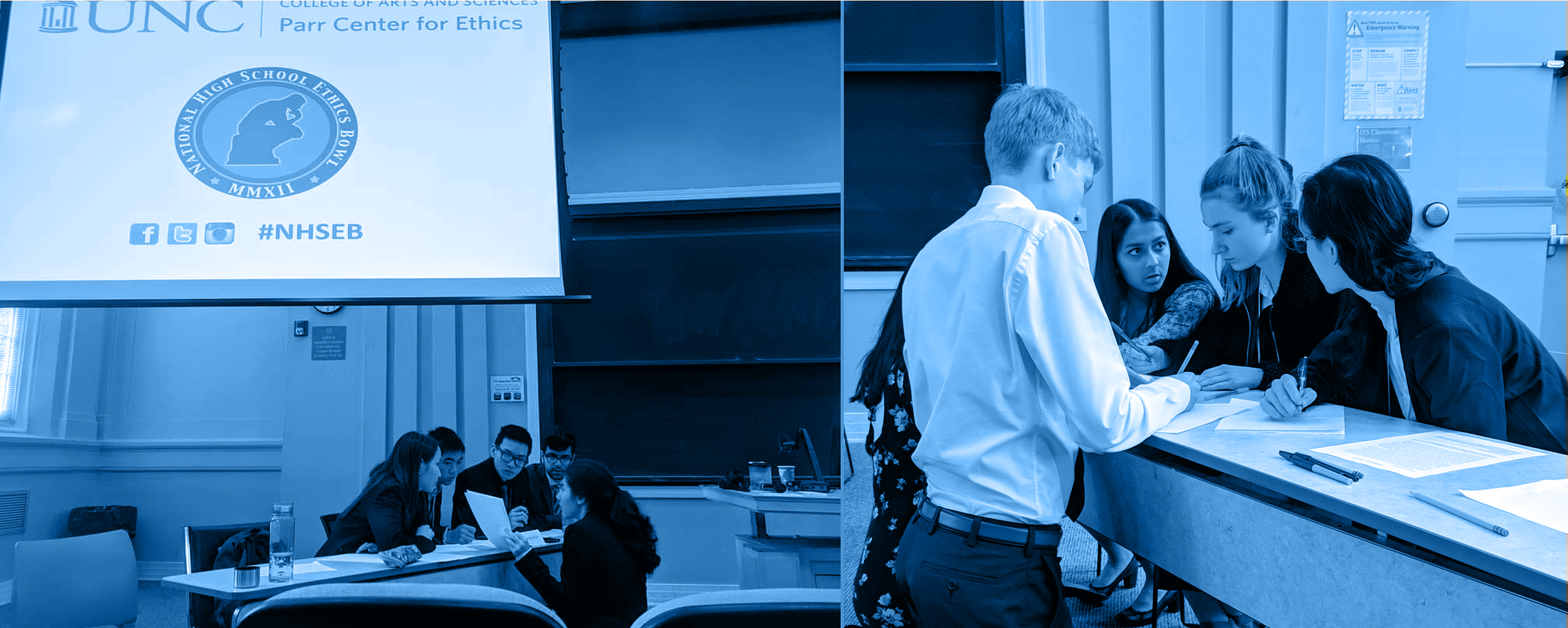
NHSEB is a national high school debate that has been running every year since 2012. It’s a series of live events with a moderator guiding two teams to share their opinions with a panel of judges voting to see who won. Each year, various students from across the country come to debate topics based on current events, and a champion team will be awarded at the end.
01 The Problem
01 The Problem
Since everything moved to a virtual space, the organizer tried to use Zoom, but due to the multi-layered nature of the match, it was hard for the moderator to set up the breakout room multiple times and keep track of the score.
02 The Goal
At the end of 3 months, the goal was to create a platform that automates virtual event creation through Zoom integration, pre-creates a breakout room, and includes other additional functions that allow the successful debate match to be hosted virtually.
03 Impact
Working with stakeholders and the tech team, I designed a tactical solution within 3 months that helped future-proof the existing process.
NHSEBONE is a web app that allows organizers to run the competition effectively and participants to experience the Ethics Bowl competition virtually like they would’ve done in person.
Moderator and Organizer View
Moderator and Organizer View

The organizer set up the event first by adding various rounds.
The organizer set up the event first by adding various rounds.
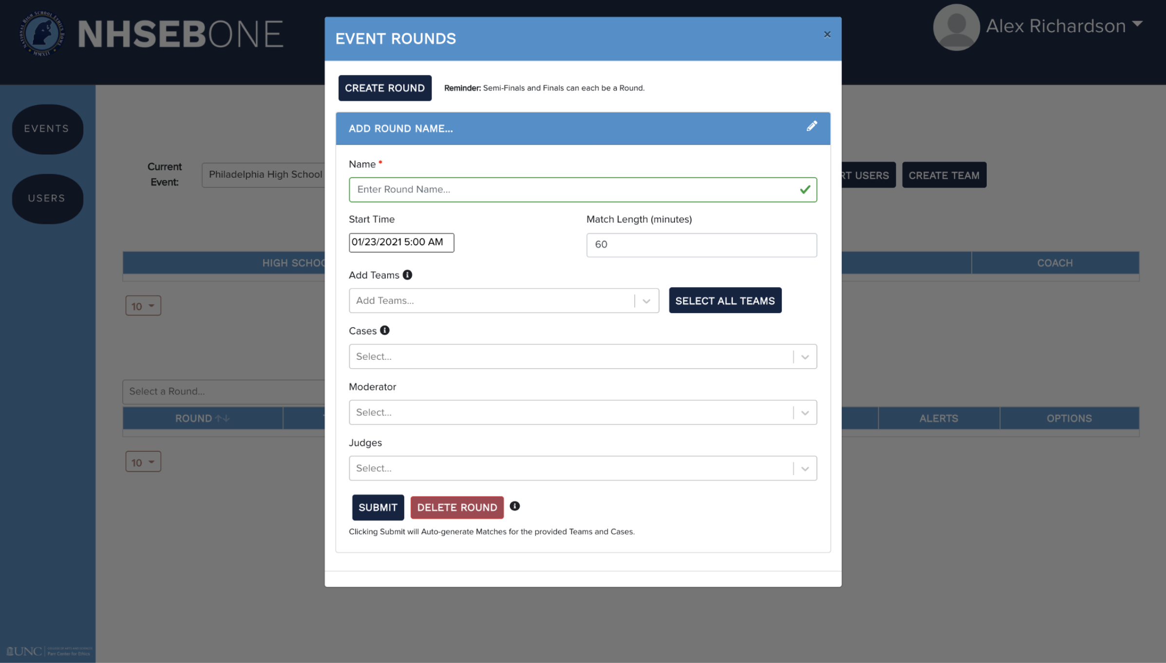

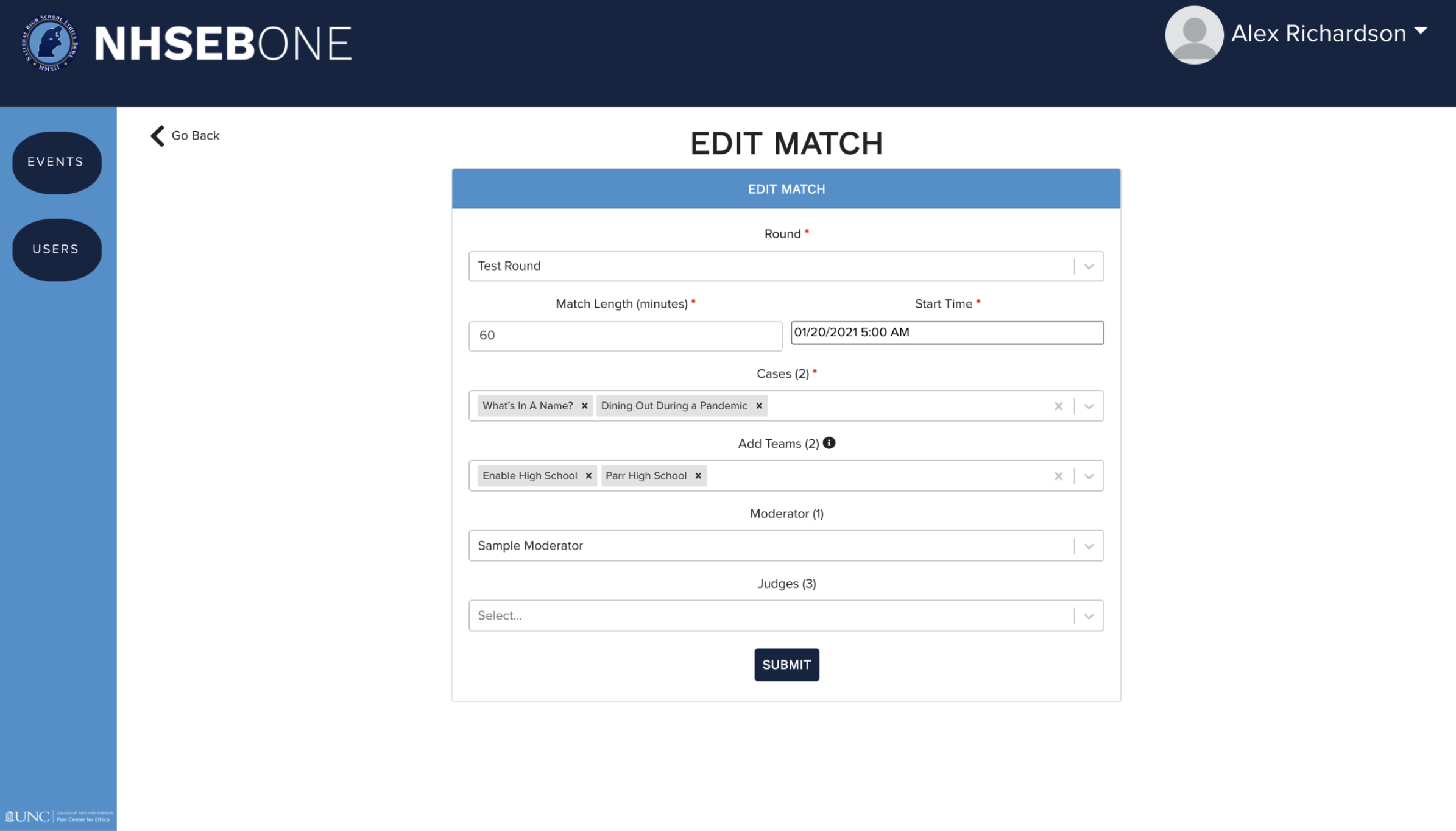
They can then add and set up matches in an event by adding the team, moderator, judges, and specific cases to debate.
They can then add and set up matches in an event by adding the team, moderator, judges, and specific cases to debate.

During a live match, the Moderator can access team information and take additional action to help guide the attendees.
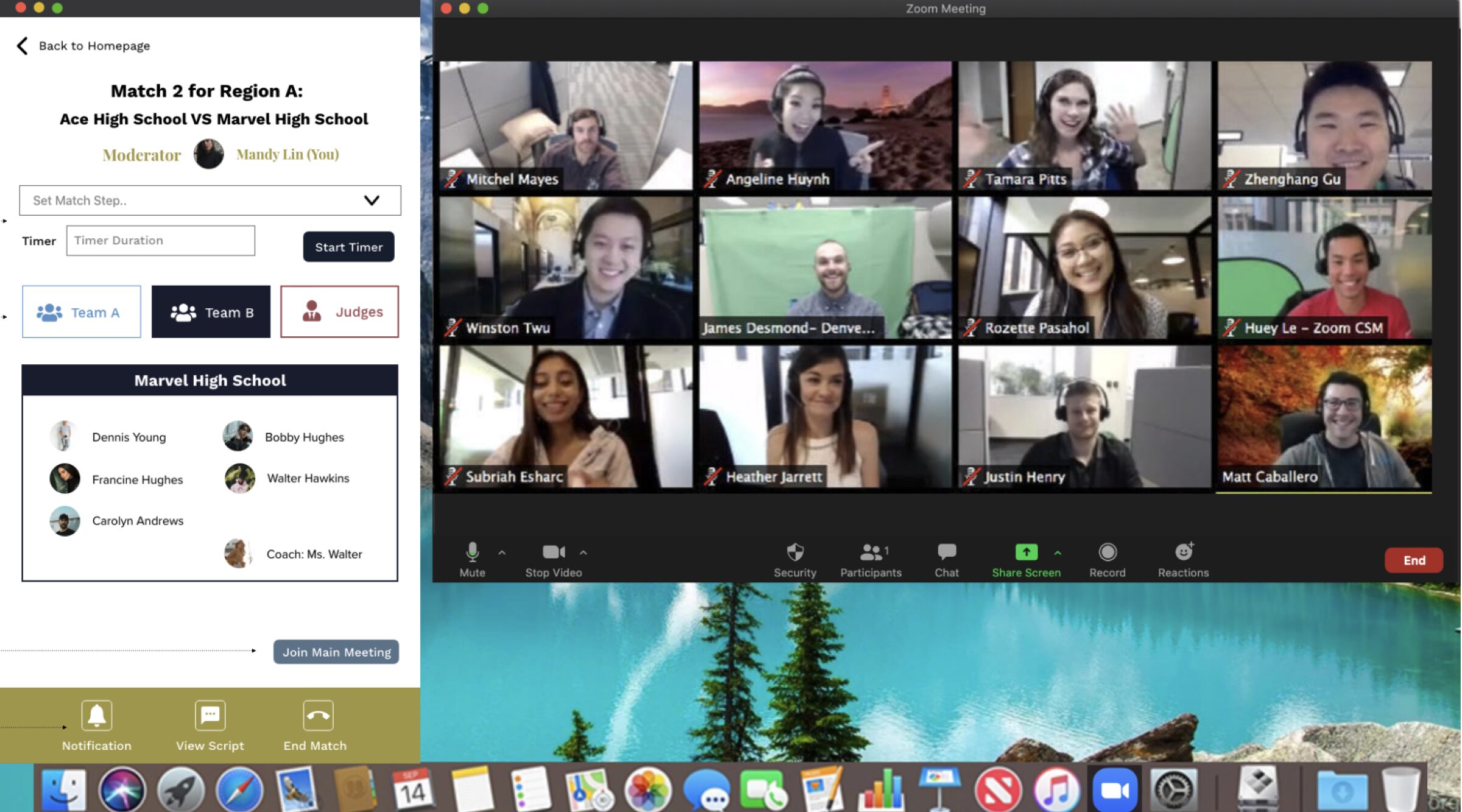

The moderator will be able to send a notifications, send each team to their breakout room and run the match seamlessly.
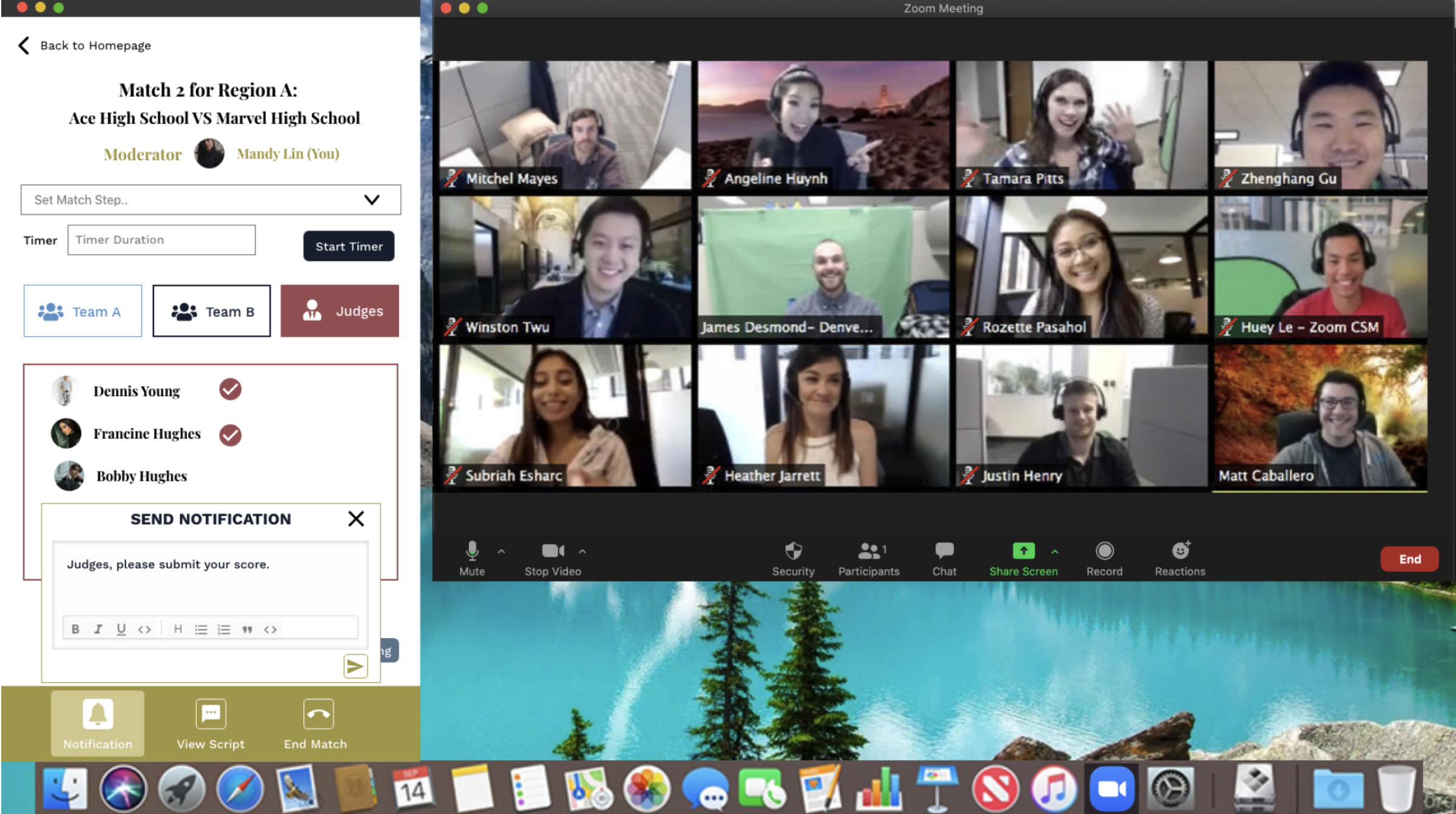
“Version 1.0 of NHSEBOne was activated in January of 2021 and was used to conduct over 75% of NHSEB’s Regional Competitions (37 U.S. events as well as several international ones) during the 2020-2021 Season.”
“Version 1.0 of NHSEBOne was activated in January of 2021 and was used to conduct over 75% of NHSEB’s Regional Competitions (37 U.S. events as well as several international ones) during the 2020-2021 Season.”
04
The Approach
Where do I start with limited resources and a tight timeline?
Where do I start with limited resources and a tight timeline?
001 Understanding the current state
As the solo designer for this project, I conducted various interviews with clients to understand the current process and the challenges various users face. Unfortunately, due to time constraints, I couldn’t talk to the targeted user for this application. So, my goal was to visualize the current process using user flow so that I could be on the same page as the client.
By understanding the various touch points before, during, and after a match, I was able to map out the competition process and better understand the needs of various roles.
By understanding the various touch points before, during, and after a match, I was able to map out the competition process and better understand the needs of various roles.
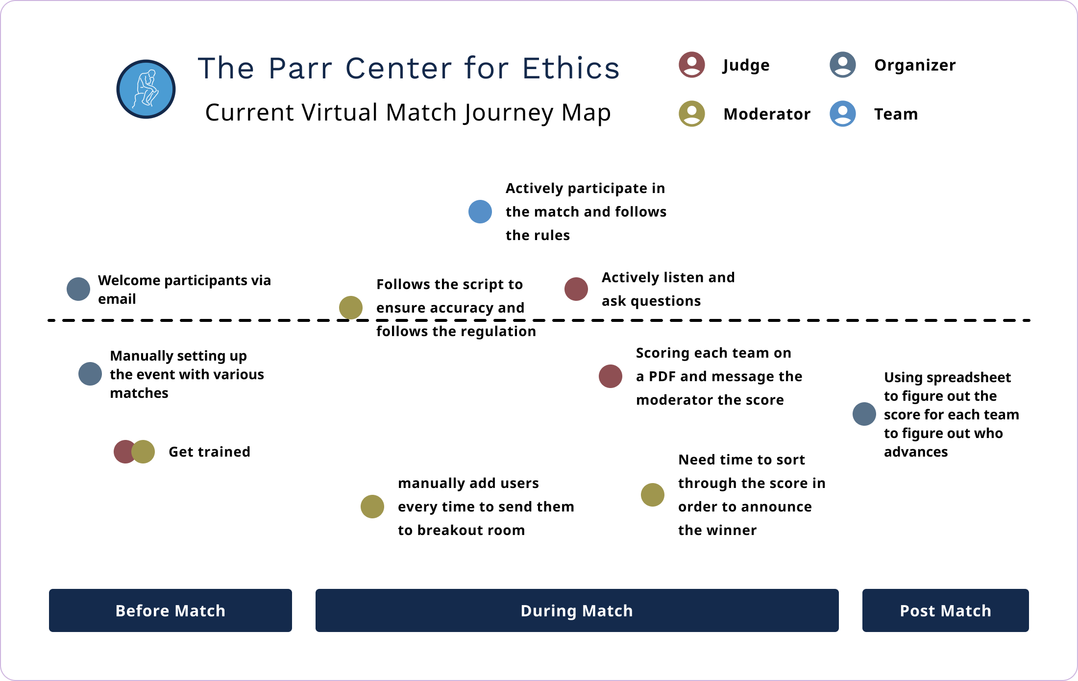
002 Prioritizing specific user goal and workflow
Since this project focuses on improving the in-match experience, the primary user will be the moderator, with the judge and the student being the secondary.
Key Features for Moderator
Key Features for Moderator
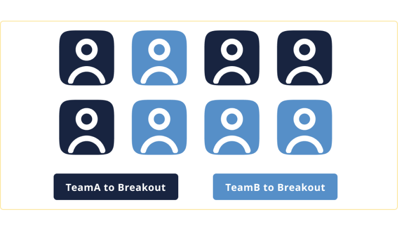
Enabling the launching and closing of the breakout room with a click of a button.
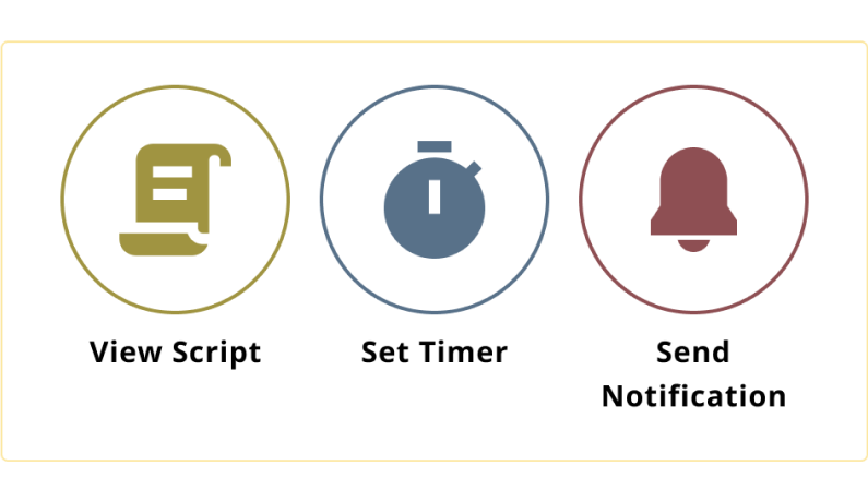
Host additional functions that the moderator will need to make the experiences more seamless.
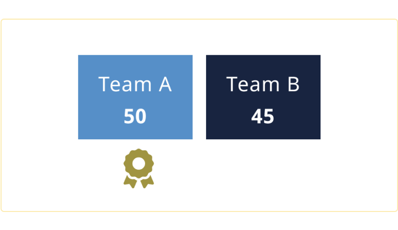
Ability to review a judge’s score and announce the winner of a match instantly.
05 Initial Design
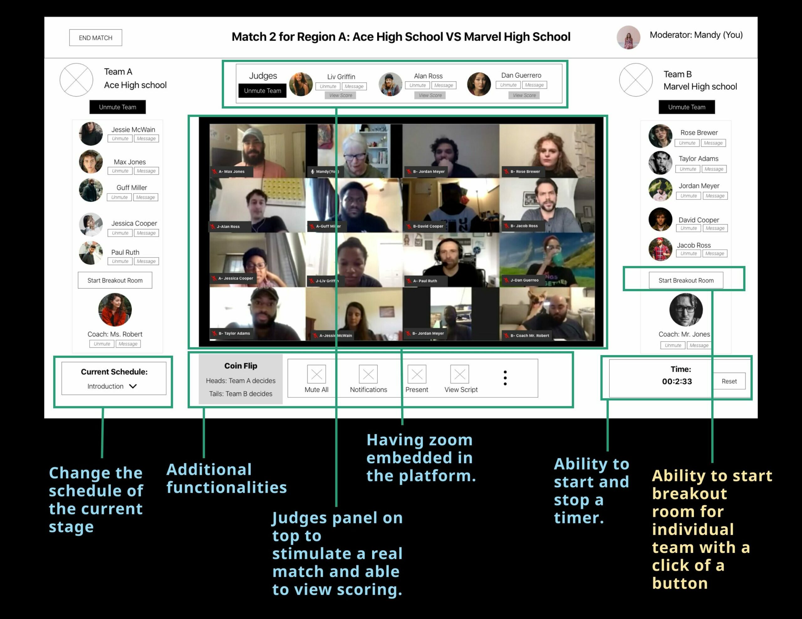
The vision is to stimulate the virtual experience close to the match in real life. Thus, the first design was born to feel like a virtual game, with video (or avatar) of individual users arranged in how they would expect to sit in real life.
Moderator view of the match
Moderator view of the match
The client was happy with the flow and the design direction. I was ready to process the final design.
I was not prepared for the huddle that was yet to come.
06
The Constrain
While investigating the solution, I ran into the biggest design challenge of this project. My development team and I realized that my design would not work because the current Zoom SDK does not support the gallery view to be embedded into a platform, which was a huge no-no for our client. Alternative iterations needed to be drafted to solve this problem.
With those restrictions in mind, we returned the project’s initial goal. top right. Have Fun!
Empowering moderators to host multiple virtual matches by streamlining their work process.
To meet the timeline, we focused on simplifying the design by designing a Zoom companion that would be placed beside Zoom and have additional functions that users would need.
07
Final Design
07
Final Design
This controller will be known as V1 (phase 1) of the development, which will be developed first to fulfill the desired outcome quickly. It also includes additional functions for V1, such as notification, timer, and various resources that can be displayed during the match, which will make the process more seamless.

Moderator
Moderator will be able to change through different steps, and each step will have a specific setting attached to it. Such as during the Case A: Team A conferral step, the moderator will see the conferral room and putting the specific teams in their conferral room. Moderators can also view their scripts without disrupting the setup of Zoom.

Student
While on the correct step initiated by the Moderator, the student will be able to join the conferral room by closing the current Zoom window then click to open the conferral room. They will be able to see the timer that's set out by the moderator, who will also notify them when the time is up and close the conferral room.

Judge
After students came back to the main room, they will present their idea regarding the case study. The other team will have an equal chance to conferral and rebuttal. Based on the conversation for both teams, the judge will be grading them on the platform via a sliding score module.
08 Impact
After we completed the V1 at the end of December, we were able to test the experiences with some smaller matches.
“Just a few weeks after its activation, NHSEBOne was used to conduct over 30 events. For the year, 85 percent of the regional competitions adopted the platform. By the end of the 2021 season, 38 events were conducted on a platform that did not exist six months earlier.”
“In December (2021), the team (NHSEB) was awarded the prestigious Prize for Excellence and Innovation in Philosophy Programs by the American Philosophical Association,.. cited the program as “evidence of philosophers doing their best work in a public forum to advance the public good.”
09
Reflection
There were many obstacles along the way for this project, particularly the unforeseen technical obstacles that resulted in a few design overhauls. Due to this and the time restrictions, some design decisions were made solely because it was the only way to accomplish what the client needed to do. I would love to get feedback on the effectiveness of the side-by-side display and how I can make it even more seamless.
If I had more time, I would want to make the UI more engaging and perhaps think about more pre-design notifications I can add or ways to onboard the user to make it less overwhelming. What can I do to let the participants focus more on the match that is happening on the left side yet, at the same time, be aware of any transitions/updates that are happening on the left controller?

